10 Tips to Improve the Usability of Your Avenue Course
Avenue to Learn may seem like a swiss army knife: it can do a lot of things, but all the extra gadgets make it more difficult to find the two tools that you actually need. With functionality comes complexity, and complexity is something we want to reduce in the design of online learning interfaces like Avenue. Luckily, it’s possible to make your Avenue course shell much easier to use and navigate for your students using some of the tips below.
Usability is a term from the design field that refers to how easy a website or product is to use. Poor usability is a barrier, leading to frustration and disengagement. With a bit of time and effort, you can improve the usability of your Avenue course so that your students will be able to better focus on their learning experience. And remember: you are also a user of your Avenue course shell, so being intentional about incorporating good usability practices also helps you!
Need help with any of the techniques below? E-mail mordelld@mcmaster.ca for an Avenue usability consultation.
1 – Customize the homepage to suit your course design
Your homepage arguably has the largest impact on the usability of your Avenue course shell: it’s the first place your students land *every* time they come to your course. To make the most of such prime real estate, you can customize the homepage so that students (and you) are able to reach key activities directly without relying on the top-menu navigation.
What constitutes a usable custom homepage will differ from instructor to instructor; your course design and the learning environment you are trying to create should drive how you arrange your homepage. As a starting point: what resources or activities will your students access most often? Will you be teaching synchronously on Zoom or Teams? Provide a link to the meeting on the homepage. What other components of your course should be reachable directly from the homepage?
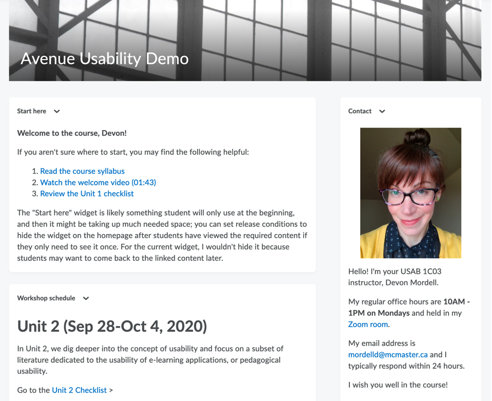
Learn how to customize your homepage in Avenue. You may also need to create custom widgets – components of the homepage – described in Tip 2 below.
Take note: changing the homepage after students have developed their own strategies for navigating around your course can be disorienting, so it is best not to do it during the term. Instead, try customizing the homepage for your course design in Winter 2021.
2 – Create custom widgets to connect students to frequently visited tools from the homepage
To leverage the homepage to its fullest, you can create custom widgets with content that you design. Widgets in Avenue are like the building blocks of the homepage, and by default they are provided for you: Announcements, Content Browser and so on. But you may want to include a widget that helps students get to know you or orients them to the course – and you can do that with a custom widget. Custom widgets are built with an HTML editor, meaning there’s a lot of potential of what you can do with them: link to content and activities in Avenue, embed video, and much more.
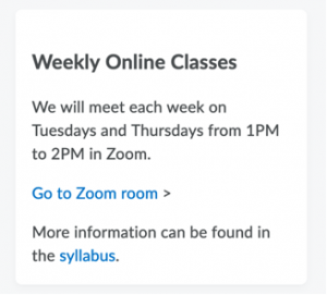
Learn how to create custom widgets in Avenue.
3 – Remove unused tools from the top-level menu
When students are not on the homepage, however, they will likely use the top-level menu to move throughout the course shell. By default, Avenue displays all of the tools available in the top-level menu when you first create your course. If you aren’t using a given tool, however, it can clutter up the navigation and make it less easy for students to find the links that they need. Setting a tool’s status to “Off” in Course Admin (Course Admin > Tools) will remove it from the top-level menu, leading to a more streamlined experience for you and your students.
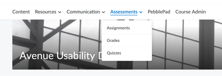
Take note: turning some Avenue tools off can affect the functionality of other tools you do need, so only disable those tools in the top menu that you don’t need; when in doubt, leave it on.
If you are using Respondus in your Avenue course: the 1) Quizzes, 2) Self-Assessments, and 3) Surveys tools must be enabled for Respondus to function. With many thanks to Krista Howarth of Kinesiology for her detective work in determining exactly which tools need to be kept!
4 – Incorporate wayfinding strategies for students
Wayfinding is often associated with the physical environment – the cues we use to find an office on campus, for example – but we also rely on wayfinding strategies when navigating a website. We may assume that students will be able to get around our course shell efficiently but even with a limited variety of options, there are a diversity of ways an Avenue course can be set up; students, then, are having to learn a new interface for each course they are enrolled in every term. Building in wayfinding strategies like landmarks and signage can reduce some of the cognitive load students might experience.
Landmarks help orient student to where they are; examples include course headers (so they know what course they happen to be in!) or section banners in the description for a module (“You are in Week 1”). Signage helps to point them to where they need to go, if you think of their navigation of the course shell as a series of paths. If you would like students to work through a week of course content, how will you guide them along that path?
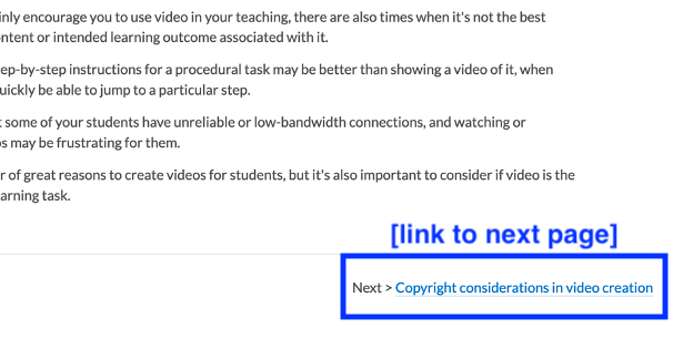
For instance, including a “START HERE or “Read Me First” widget on the homepage would be a wayfinding strategy directing students towards the course syllabus, an orientation video that describes how the course shell is organized (another wayfinding strategy, a map!) and a discussion forum for class introductions by linking to each.
5 – Link directly to content and activities
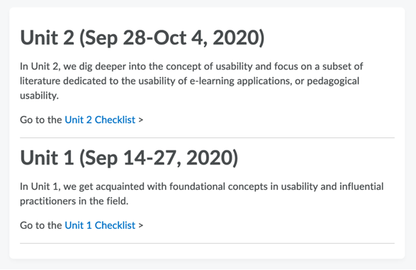
A little usability improvement that goes a long way is to link directly to items rather than, say, telling students that an assignment is due and expecting them to navigate to Assessments and then Assignments, and then find the assignment in the list of assignments. Steve Krug, who has written a couple of great books on web usability and usability testing, summarizes his stance as “don’t make me think.” We do want our students to think – but about what they are leaning, not where to find Quiz 2 or the FAQ discussion forum in the course, when we can just point them there with a link.
You can link to content from anywhere that provides you with an HTML editor: announcements, the description fields for checklists, the description fields for modules, files you create and more. If you can get into the habit of linking directly to content and activities, you will streamline your students’ experience of navigating the course considerably!
6 – Structure the content area to reflect the organization of the course
This usability improvement is likely one that most of us do already, structuring content by week or by unit – partly because it helps *us* manage a daunting array of files. You can also create sub-modules if you’d like to group resources within a content module into smaller, more manageable (or meaningful) blocks.
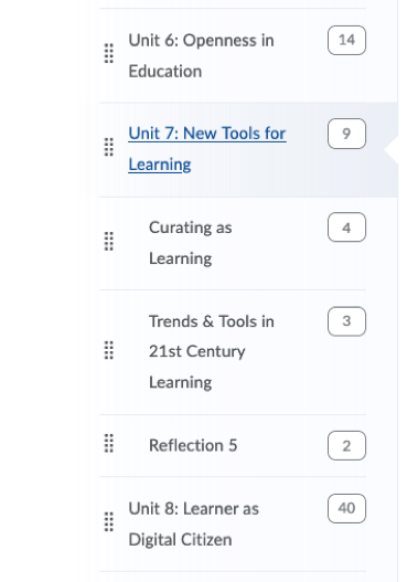
You can also minimize some of complexity of the content area structure by hiding some of the modules if they are meant for later in the course – to start your students may only see week 1 content, meaning they have much less to navigate initially. But there are a couple of drawbacks:
- you then have to manually make the following week modules visible, meaning setting a reminder for yourself on, say, Sunday mornings, to make each week visible (you can always check the visibility of items in content by viewing your course as a student)
- students may wish to work ahead or preview what’s to come, so hiding content prevents them from doing so
7 – Label content meaningfully
In addition to structuring content, consider how you label it – do you have a consistent approach to indicating something is optional? Is there other metadata that you can provide in the title that helps students to understand what a content item is about?
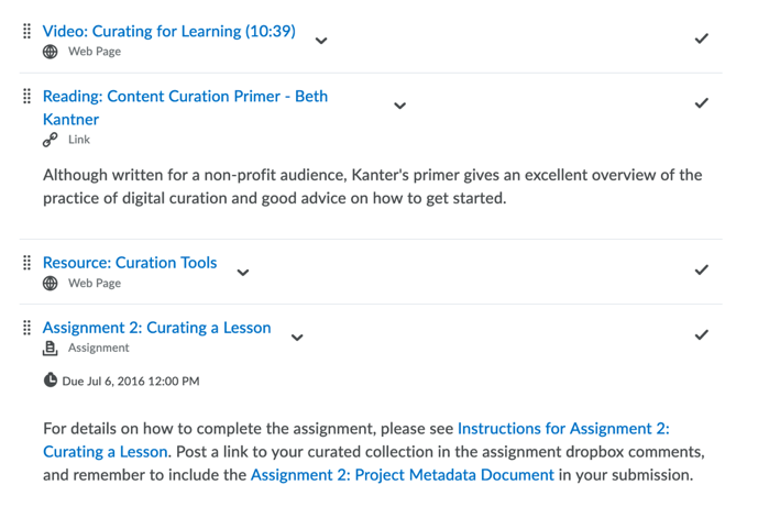
For instance, “Read ‘10 Usability Tips for your Avenue Course’” instead of “10 Usability Tips for your Avenue Course” and especially instead of “x90b407.pdf.” Or, “Video: 10 Usability Tips (3:48).” Students not only have a sense of the content from the title, but they also know that it is a video and the duration of that video without having to click on the link to view it.
It’s not something to go overboard with, because there’s the potential to reintroduce complexity with an elaborately long label. But think about how you can use labels – or the titles of various objects – strategically to provide richer information about the content.
8 – Leverage item and module-level descriptions
In the classroom setting, we can provide instructions such as “you should be starting your final project if you haven’t already” – instructions that are often omitted in the online learning environment. Module-level descriptions offer an opportunity for you to communicate your expectations for what students are meant to do with the course content in the module (e.g. week or unit).
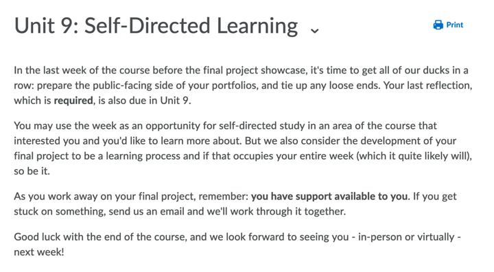
Similarly, item-level descriptions give you the ability to annotate individual content items, allowing you to contextualize them the way you might in class.

Take note: sub-module level descriptions aren’t shown until the student actually navigates to the sub-module (which they may be unlikely to do when they can access the links without expanding the sub-module). So, if you are planning to write descriptions at the sub-module level, you may want to save yourself the labour and focus on the module level.
9 – Start each week or unit with a checklist
Checklists are the unsung usability hero of Avenue; they very clearly convey to students exactly what they are expected to complete in, say, a week and help them keep track of what they’ve done so far and what remains.
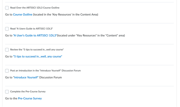
The description field in checklists is an HTML editor, so you have the capacity to put links to content within them to eliminate any ambiguity about where to find a given resource. You could even use a checklist as the interface through which students access course content and activities.
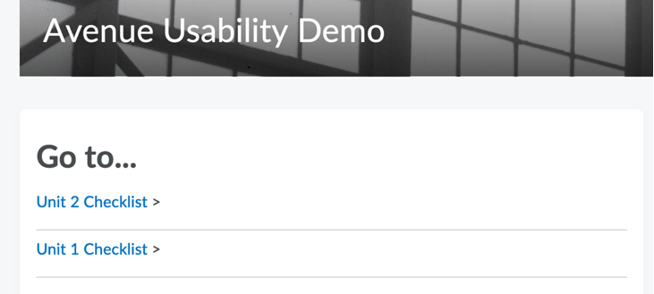
Take note: too long a checklist may seem daunting, so limit them to the content within a module, or the tasks required to complete an assignment, and so on.
10 – Check for broken links on a regular basis

Ah, the transience of content on the web: here today, gone tomorrow. Broken links can also impact the usability of your Avenue course – and result in email labour that can be avoided – so nip them in the bud by using Avenue’s broken link checker, which is found in the Course Admin area, under the “Administration” heading.
There are, of course, more than 10 Usability Tips (e.g. using intelligent agents to help students stay on track). Have any other usability tips you’d like to share? – let us know at mordelld@mcmaster.ca.
Updates
